Five homepage concepts
All five share the same brand system (logo navy and orange, the new teal, Sora and Manrope type, the three gradients) but take a different approach to how a customer finds their way around a large catalogue.
Mega menu
The long category list moves into a navy bar of six departments that open full-width panels.
- Frees the whole page for merchandising
- Uneven "bento" category tiles
- Most conventional modern store layout
Classic sidebar, modernised
Keeps the familiar left-hand category list existing customers know, as a sticky accordion.
- Every category visible at all times
- Closest to the current site structure
- Lowest risk for returning customers
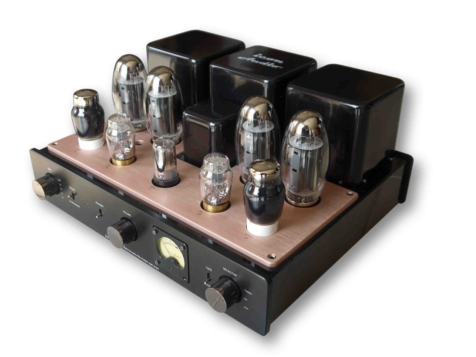
Storefront with real imagery
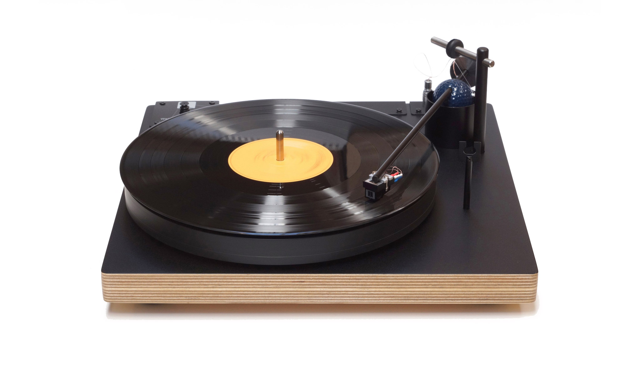
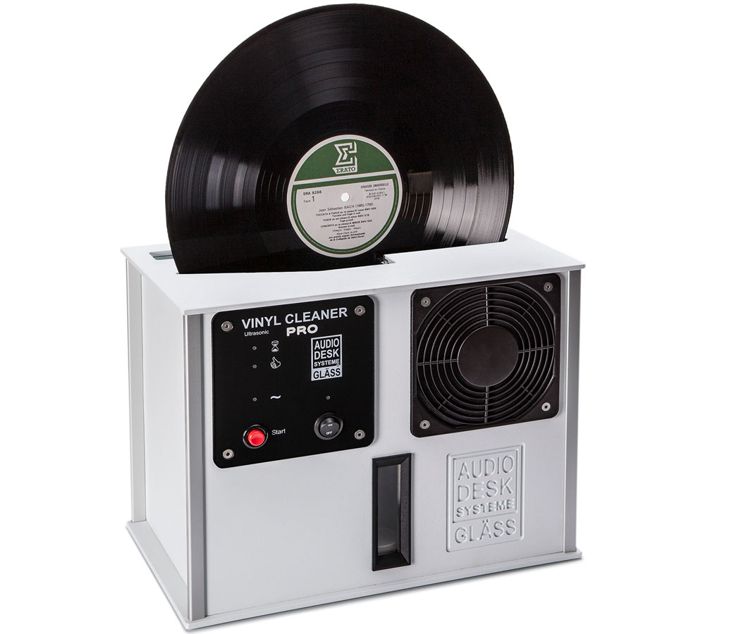
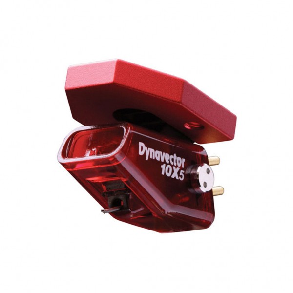
A pared-back concept 4 on concept 1's standard store layout, using real product photos and brand logos instead of line art.
- Photos and logos from the current site
- Conventional header, search and mega menu
- Shows how mixed supplier imagery sits together
The GrooveWorks house
Brand-led and high-end. Leads with reference hi-fi and the makers represented; record care becomes the heritage story.
- Light, editorial, gallery-like
- The logo's double "O" as the playful device
- "Build a system" guided shopping
GrooveWorks house with sidebar
The premium feel of concept 4 with a full category sidebar that scrolls with the page.
- Expandable categories under six department headings
- Sidebar is part of the page, no separate scroll area
- Brands and services continue down the column
About these prototypes. Navigation, categories, brand names and contact details come from the live site. Product imagery is placeholder line art (except concept 3, which uses real photos and logos from the current site), product names are sample content and prices are shown as $[price]. Links inside the pages go nowhere; use the bar at the bottom of the screen to move between concepts.